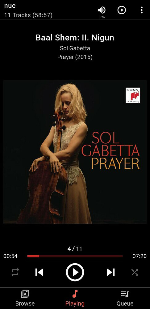
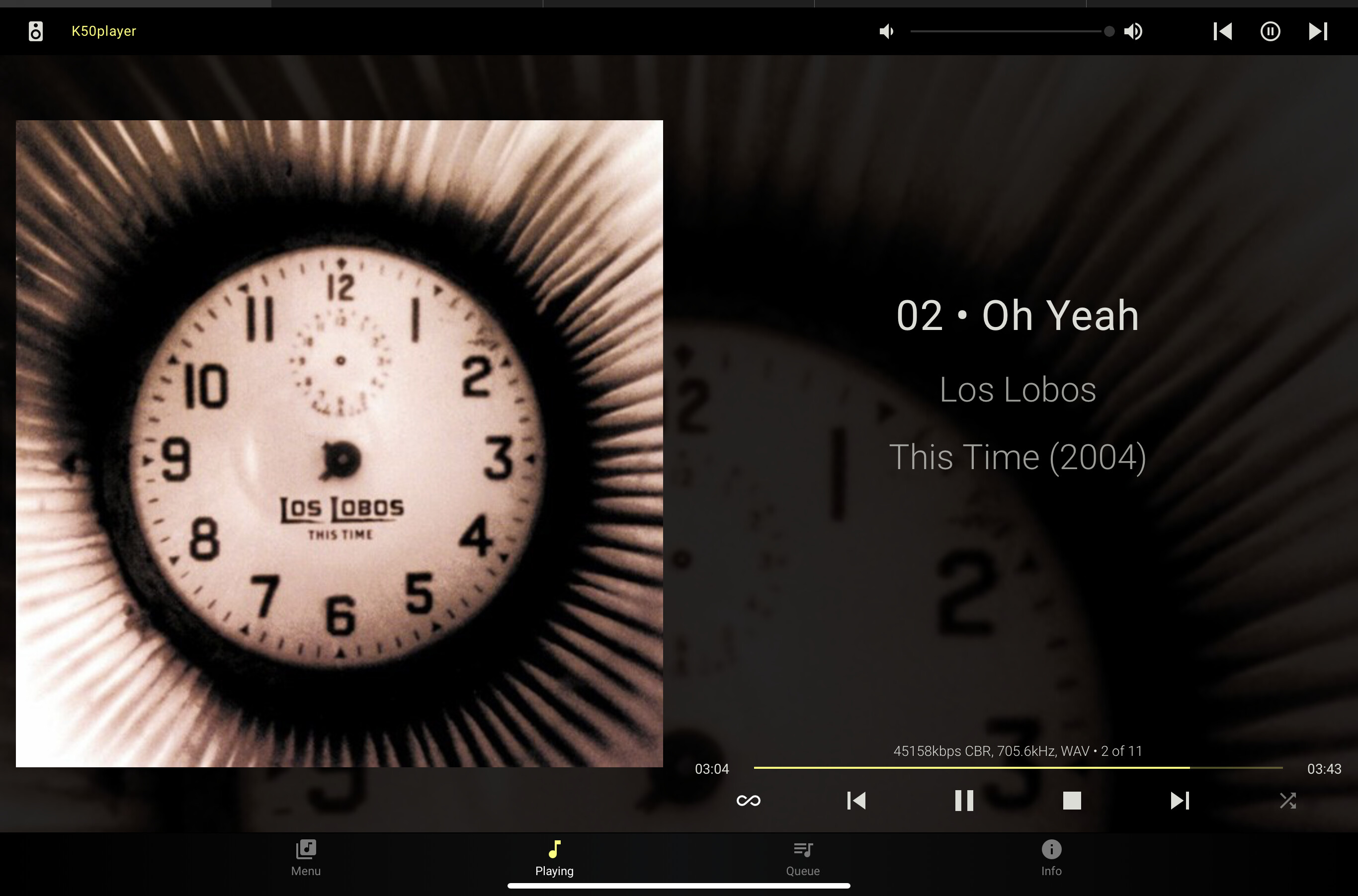
Ive been having an issue where it seems the material skin loads,… but not the right one. This happens if i have material selected in options or default, and if i load the ip directly or with the /material on the end.
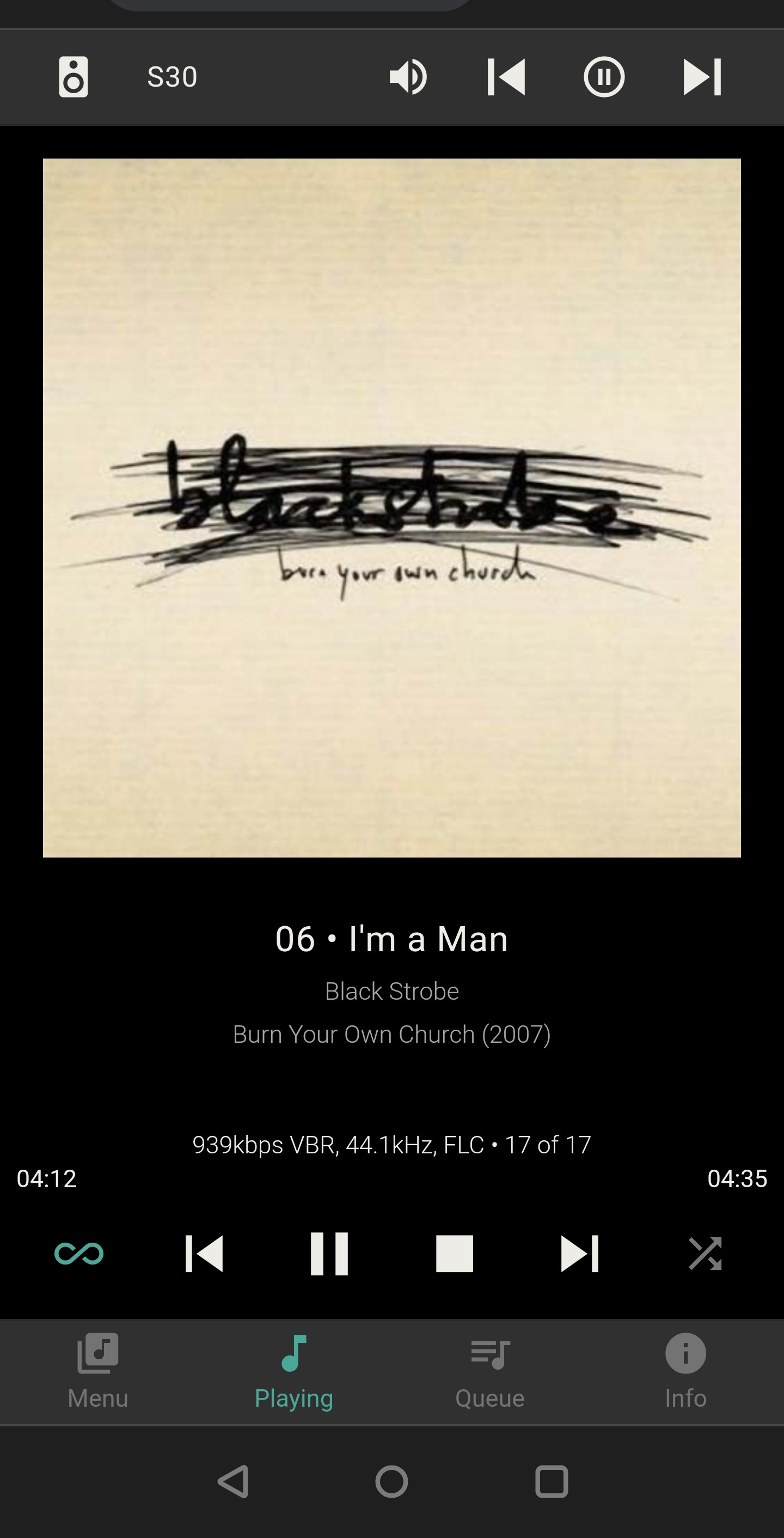
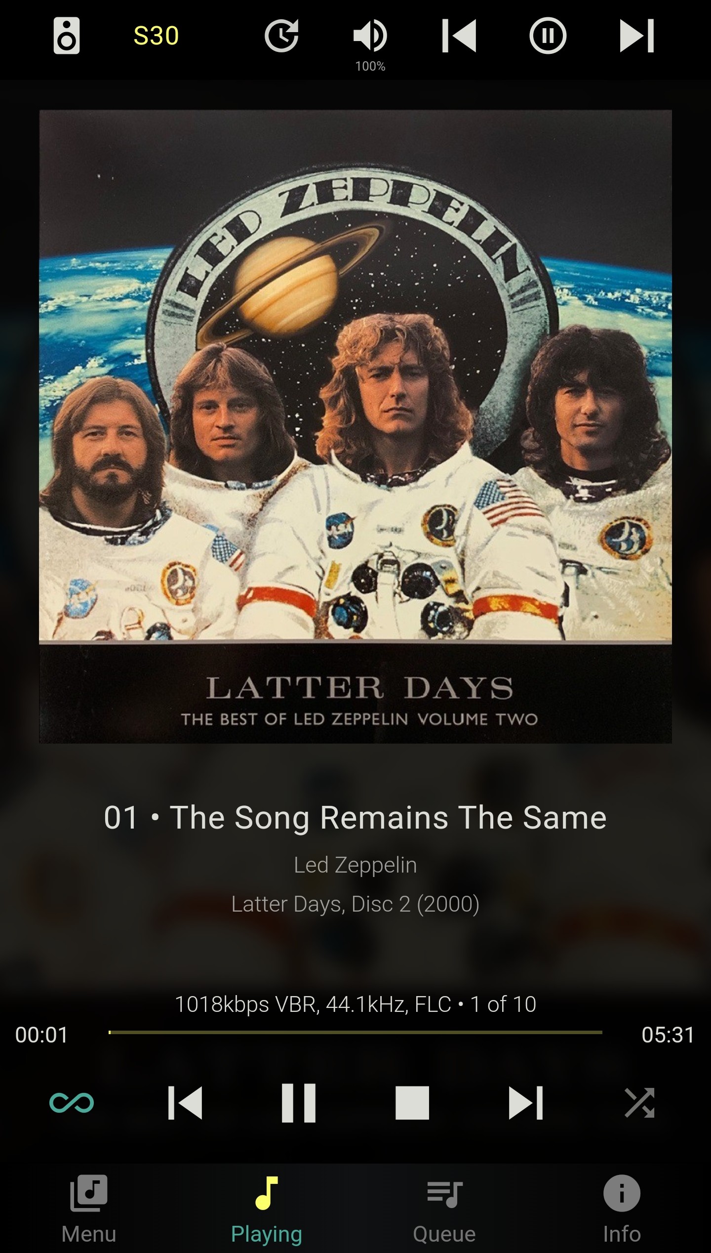
It used to be after a reset it would display the below format but only before before i reloaded or if i didnt purposely go to /material.
Anyone know how to get it to load the bottom interface reliably? I prefer this layout and it’s behaviors immensely.
I tried this on my phone and laptop chrome browsers and they both now load the top view, sometimes defaulting to the light or dark themes at random. I tried a few myantipodes.com player / server restarts, and launches from that webpage’s “play” button. I have tried physical power cycles as well. I have not hit clear database or reinstall squeeze as i got setting where i wanted and dont want to redo it all. This started before and has continued when I upgraded from v4.3 to v4.4. I have also unchecked the material plugin, reloaded, then rechecked, reloaded. No dice.
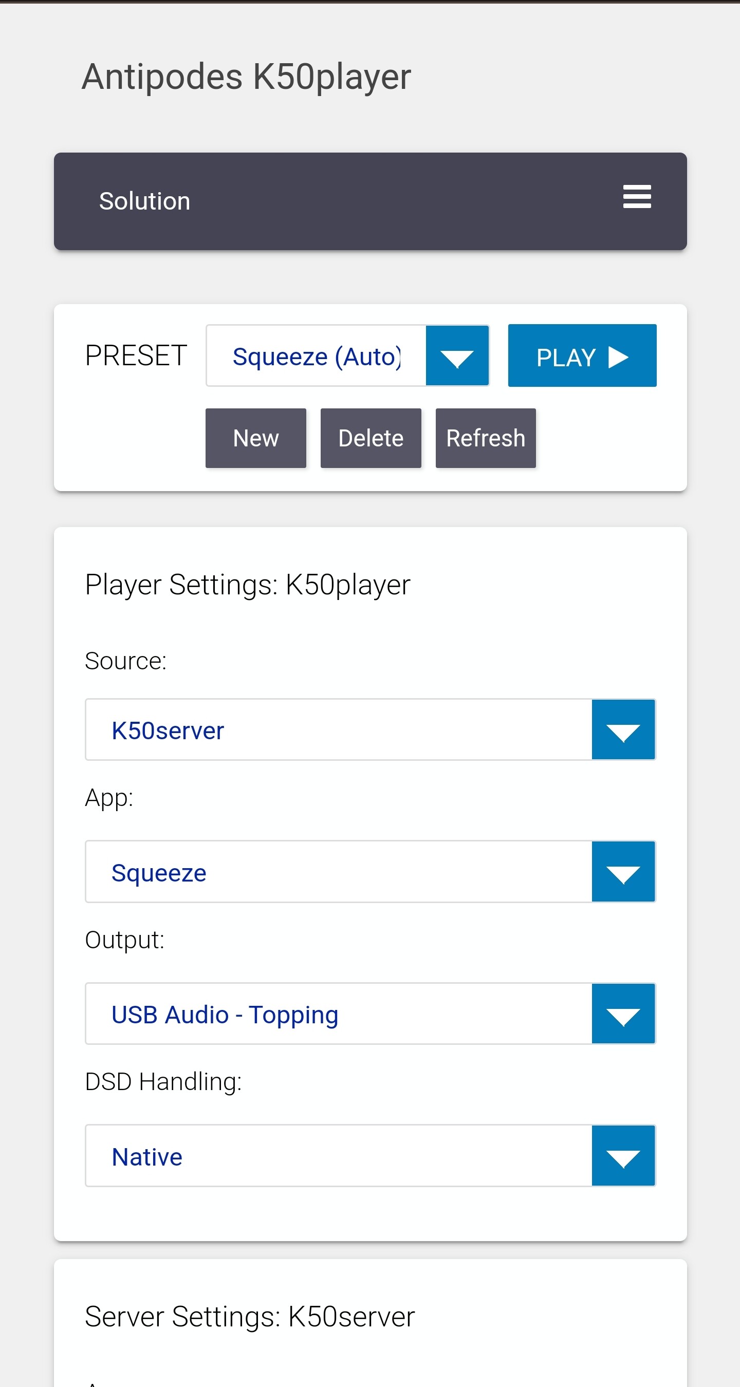
Kind of related, is there a file I can make a copy of where i can backup my server settings?
I have also preferred the default Material skin. I used to be able to force a switch back to it, but my workaround stopped working once the latest AMS update was applied.
I really hope there is a way to get it back i would even roll back the AMS to get it.
Just for the fact that accidentally hitting the back button would bring me back a page and not back to another web address. It is also very odd that it now shuffles big icons and list and still keeps color selections from the other Material interface…
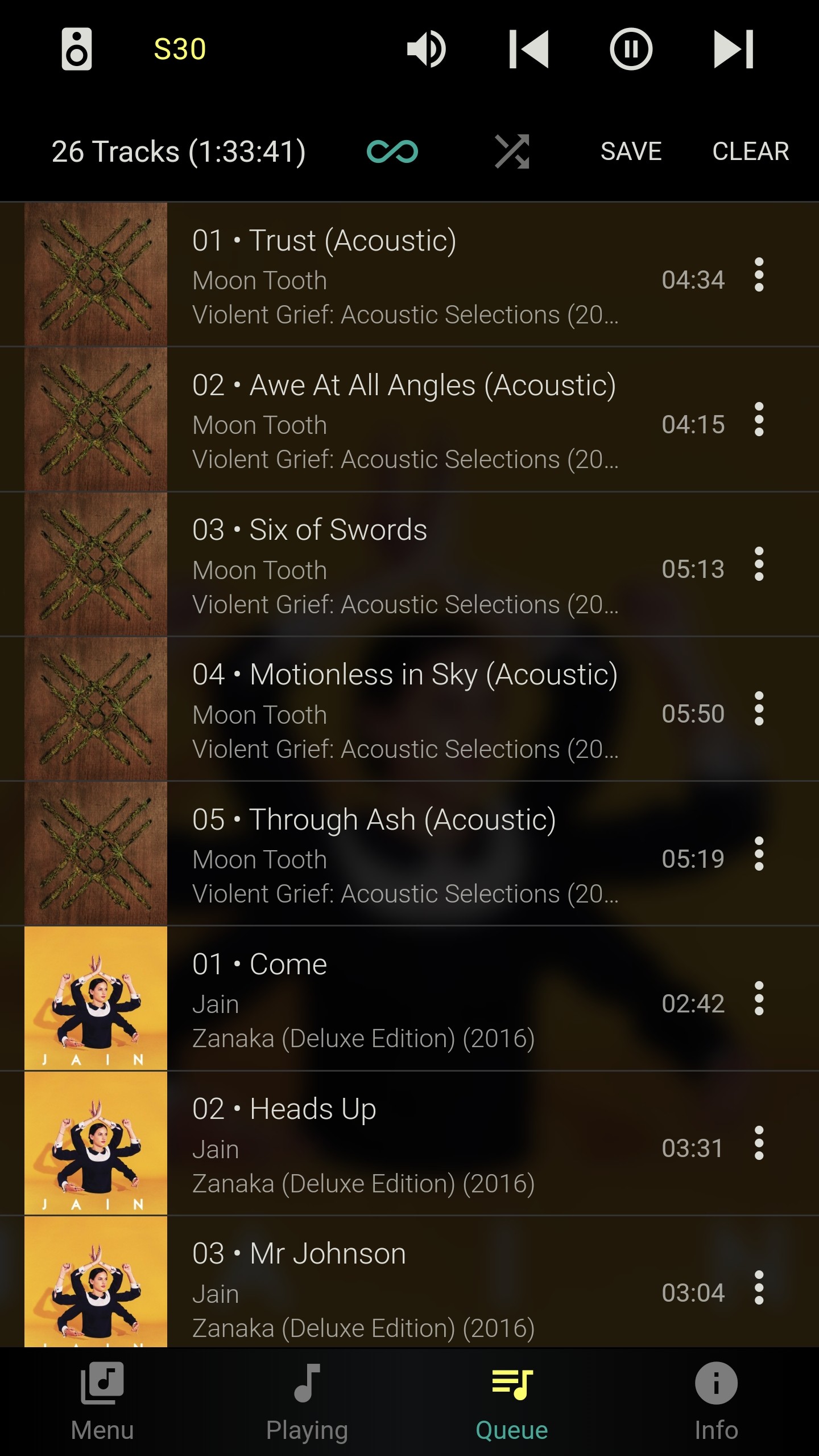
By navigating the tabs or using the 3 Dot Menu to add/load etc.
In Chrome on my Android phone hitting the back button, takes me back to myantipodes, this is after launching the Squeeze app from the Play Button on the Dashboard
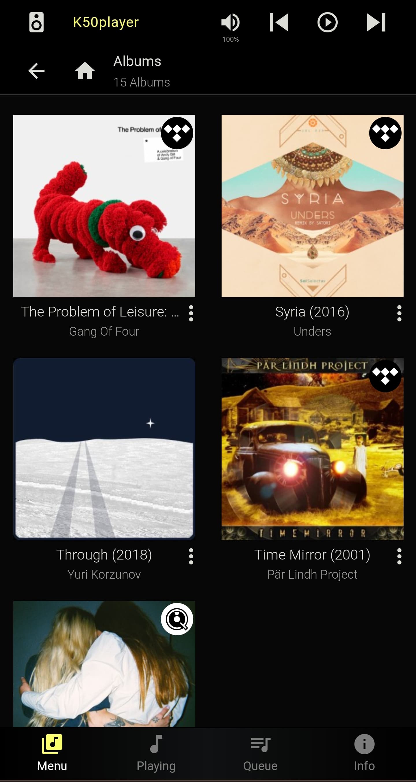
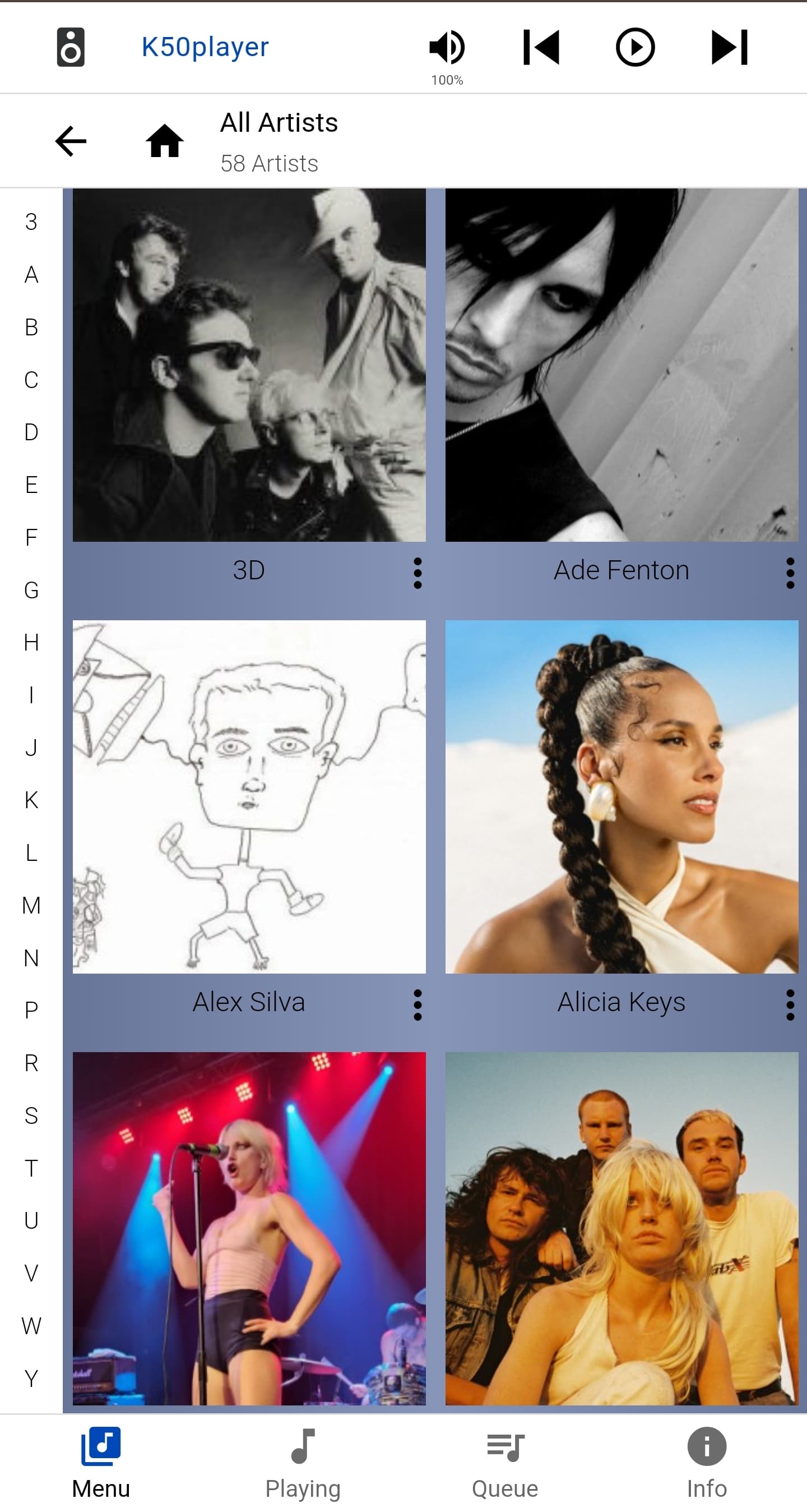
To me this was a bit neater, settings were laid out more to my preference, and i could add nice little customizations (ui color, album art background on the play screen, a more preferred, now playing screen layout). It also had some more common sense things, like the settings doesnt need to be listed on every screen, and in a bigger and bolder font than the rest of the music selections.
Always up for feedback, nothing is set in stone.
So feedback on what it is you would like to see, and we will chat internally, as mentioned in a number of other threads we have a lot of software development on at present, so I can offer no timelines.
Of course, and these are only my preferences. Not me trying to say it is the “definitive” way to use an antipodes. Thank you for being open minded. Ill collect my thoughts and send them over.
Great feedback. I especially liked the ability to access the settings from the top right menu of three vertical dots. Also, you’ve been sharing screens from the iPhone, but on iPad is where I miss the standard Material interface even more. It took advantage of the available space very well. To divide it into the four subsections per the four icons on the bottom wastes a lot of space. I really don’t need to see the album art displayed so large. Shrink the art to make room to add the play queue and the library browser here as well.
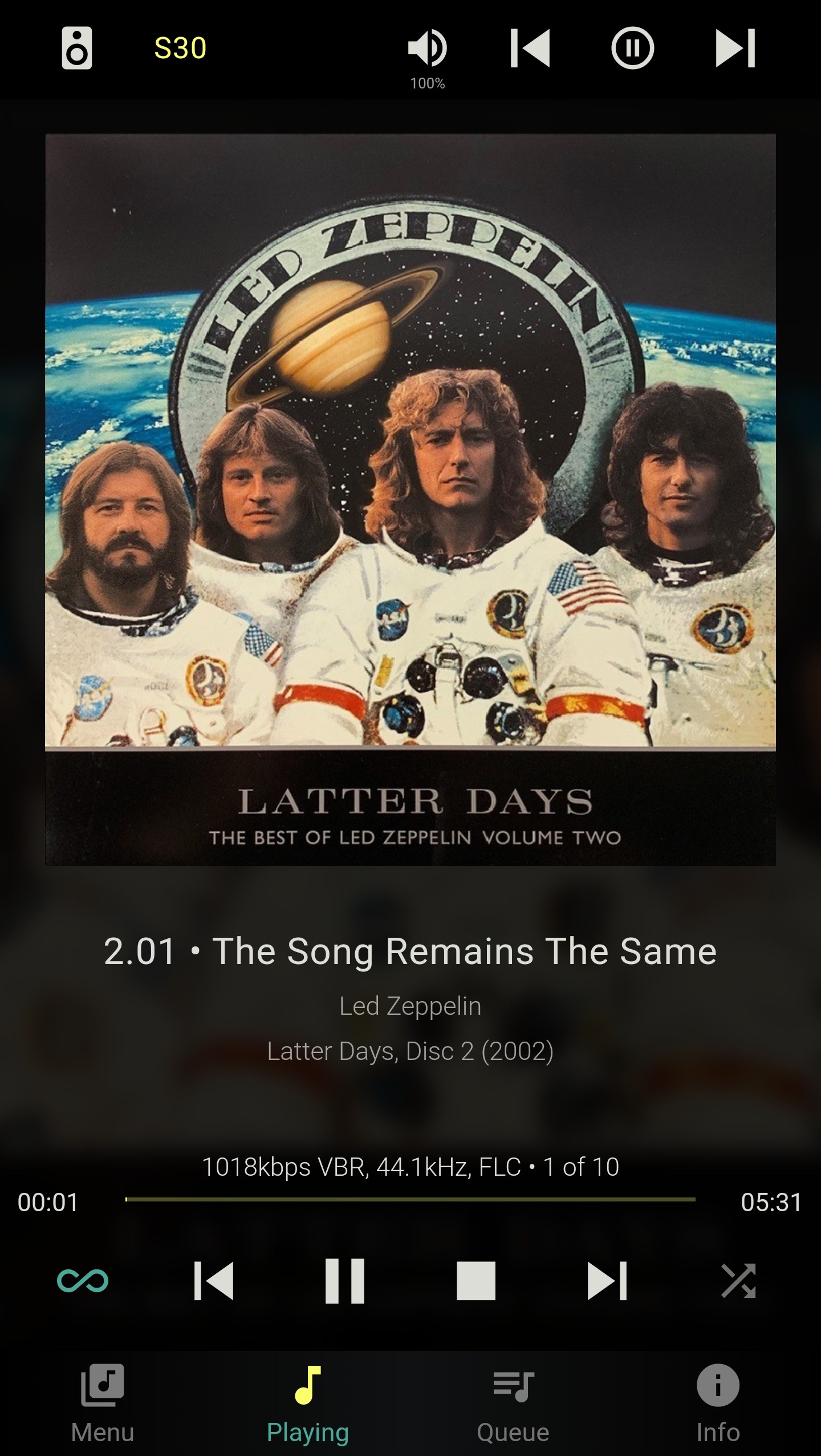
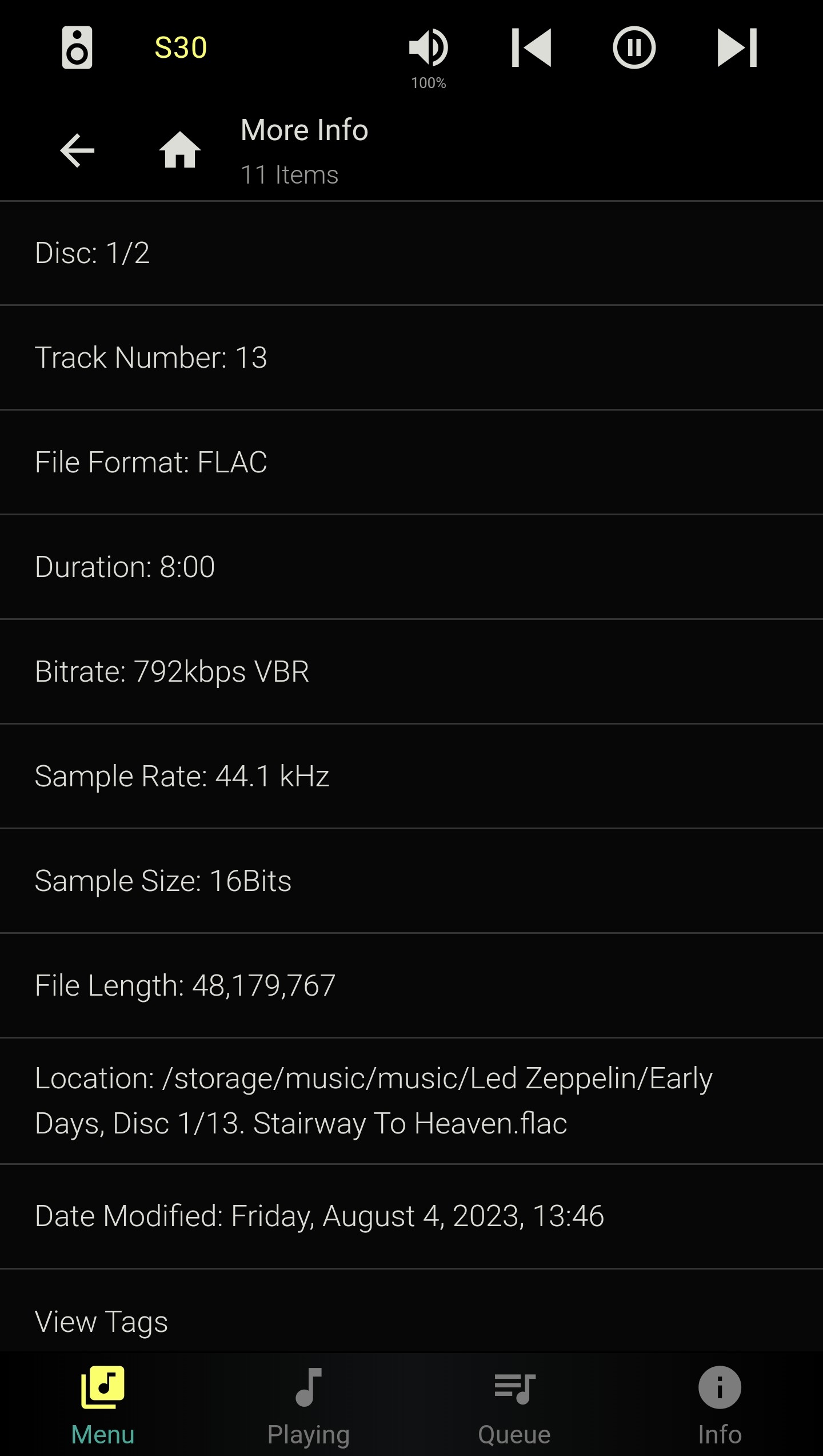
Previously it would just show like any other non multidisc album. It will also show this if you select the media quickly after a fresh “clear and scan” after a few minutes it changes to the above:
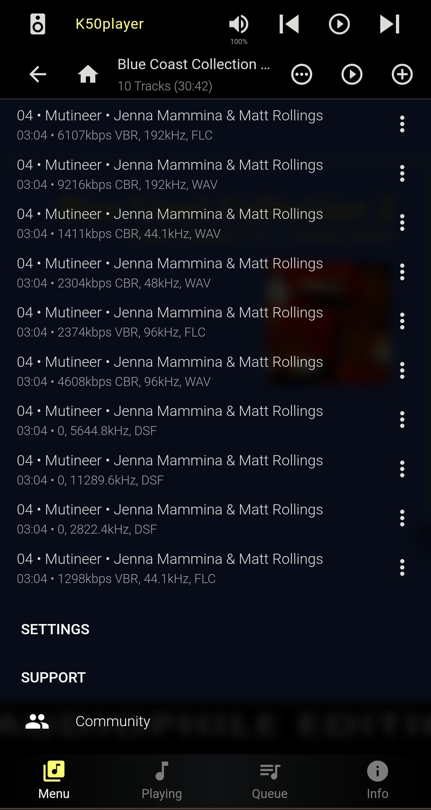
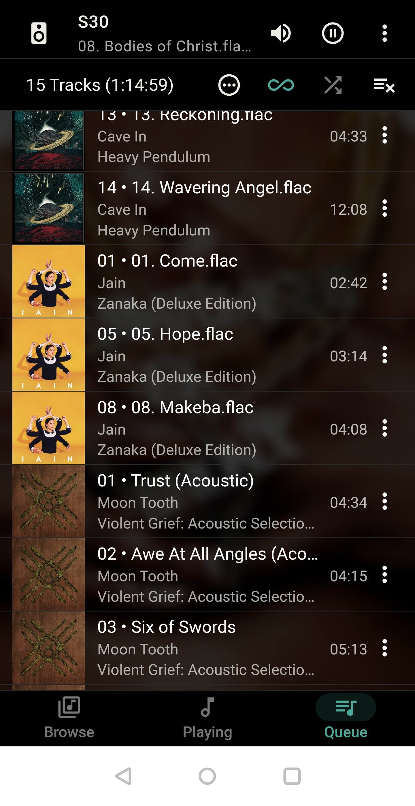
The discology info was always there, and i usually use single numbers vs #/# format that shows in squeeze (i figure this is a default as it tries to figure out that if its disc 2 it must obviously have a disc 1):
My tag method has it so all single and multidisc albums have a disc number, even if it is a redundant 1. I then use the folder hierarchy to seperate them so “ALBUM, Disc 1” will have all tracks tagged as discology 1 another folder will be “ALBUM, Disc 2” and tracks tagged discology 2.
I will also note when i add something as a discology 3, it expectedly makes it 3/3 even if there are no other albums or anything with the same name. Going into something that has a disc 1 & 2 album/folder and adding a faux 3rd album/folder, and giving it tracks with discology 3 tags will not get the previous 2 albums to show 1/3, they stay 1/2, 2/2, etc.
My question is here is more around consistency and trying to understand how things translate from file setup to UI display.
I know there was (for the life of me i cant find it now) a setting that asked if you wanted to display the track# before the title, was there something for disc # as well?
To my knowledge this should all be working off my file tags. Is there anything coming from elsewhere? I think i disabled as much as i could where squeeze may try to add info but i could have missed something, or perhaps a plugin? Sometimes even the listed year changes on the same file.
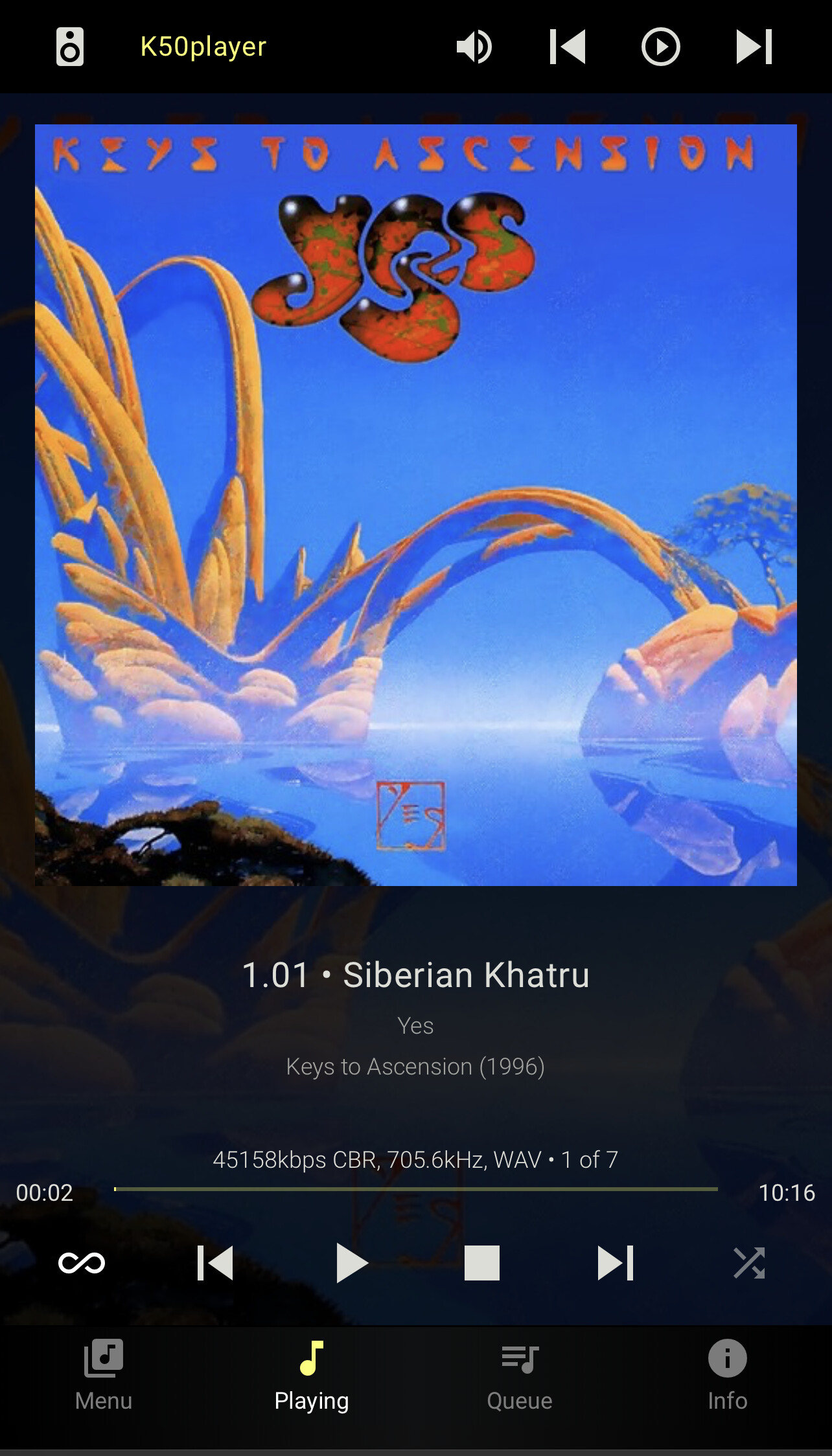
Consistency. Am I missing something but it seems something is always changing on me. Big tiles vs listed view, discology display, even now the player is suddenly showing the blurred album art background again. Are there stealth updates?
I should also note between changes I did server/player restarts, rescans, and tried incognito/new browsers. Nothing really seemed to solidly change anything.
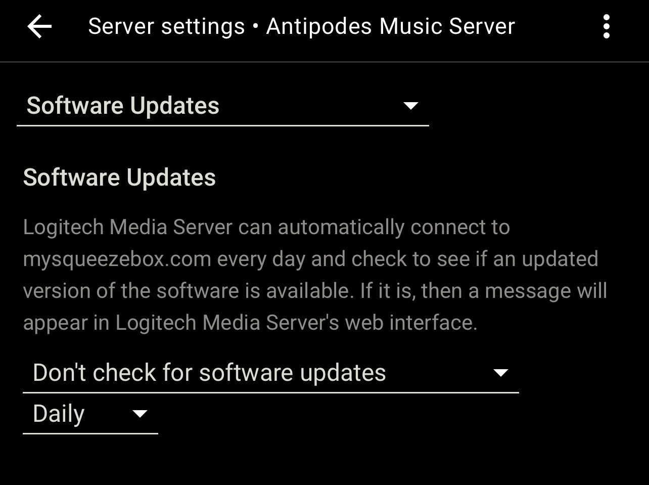
LMS has the capability to update the plugins. With the following set to automatically check, I would get the occasional message that Squeeze server needed to be restarted. I don’t believe I’ve seen that since I put a stop to checking for updates. You may see things stabilize by ensuring this doesn’t check.
I had that to “not check” as well, but i used to get those restart to update messages regardless. I think i am just trying to get more clarity on why it will display that way one second, then a few minutes later if i add it to a playlist again it will display the other.
Maybe it’s smart enough to know when one is playing an album sequentially vs playing track ad hoc, and will adapt the display to accommodate that. I won’t be able to confirm that myself later this weekend.